Multilingual desktop publishing: Always an adventure!
Multilingual desktop publishing: Always an adventure!
After translation, a brochure or catalog needs reformatting to accommodate the new language. What could be so hard about formatting a translated document? Multilingual desktop publishing is more complicated than you might think. We can’t just use InDesign to put translated text in the space where the English text used to be.
Text length
Sometimes a client wants the translated document to have the same number of pages as the English source. However, text expansion or contraction might render this difficult. Some languages “expand” during translation, requiring more space on the page. On the other hand, some Asian languages contract. A Chinese translation of an English brochure can look sparse, with too much white space.
Before translation, we can run a pseudo-translation to anticipate what design changes may be needed. Pseudo-translation creates a “dummy” translation. It mimics the qualities of the target language to predict the size of the translated document. We use this to demonstrate to a client the impact of text expansion or contraction. At this point we might discuss options for potential reformatting.
While working on Spanish translation for patient information guides, our DTP team faced text expansion-related design issues. The client did not need the Spanish guidebook to have the same total number of pages as the English source. However, they did need to have certain information and images on certain numbered target pages. Spanish “expands” 25-30%. Had this had been a digital translation project, we might have accommodated expansion by selectively using a smaller font. However, for a print document, a small font size is too hard to read. Working together with the client, we developed a style guide to address their needs and provide solutions for reflowing text. The style guide helped the DTP team to address the client’s needs for the other target languages (Chinese, Tagalog, Vietnamese) as well.
Page structure
Right-to-left languages like Arabic present their own unique set of challenges. The Arabic text needs to be oriented from right-to-left, plus the entire layout needs to be flipped. If a series of images is supposed to be read in sequence, keep in mind that these must also be ordered from right-to-left. The images themselves may need localization. For example, Arabic readers expect to see checklists presented with check-marks down the right side of the page. Sometimes the text uses both Arabic and English. It takes an experienced desktop publisher to incorporate the English words with the Arabic text. Here is an example of an English-language web page translated and localized into Arabic which demonstrates all of these differences.
Fonts
A client may want to use their corporate font so that localized documents are visually consistent with their other publications. However, the corporate font might not include the characters needed for the target language. In this case, a substitute font has to be used.
When using a substitute font, we deliver multilingual desktop publishing projects as “outlined” files. This ensures the stability of the design. If a client opens a “native” file on a machine without the proper font, the computer will either deliver gibberish (because of character mismatches) or substitute an available font that can disrupt the format.
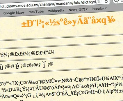
For languages with non-Latin scripts, we always provide an outlined version. This freezes the text (like a .pdf) and prevents substitute fonts from hijacking the layout.
Line and page breaks
Some languages use spaces between words in the same way that English does, making line breaks easy to adjust. But other languages have different rules about where line breaks can fall. For example, text-wrapping and line breakage present challenges for Korean brochures and e-learning modules. Korean words are composed of syllable blocks. Each syllable block contains 2-3 characters. Korean words will improperly truncate if a line break falls between the wrong syllable blocks.

In addition, the different rules of syntax make it impossible to translate phrase-by-phrase between English and Korean. Therefore, a request to have the exact same information on corresponding source and target pages can’t always be accommodated.
Similarly, in Chinese, a single word might be composed of one character, or of several characters. If a multi-character word is broken at the end of a line, the meaning of the whole sentence can change. The most skilled user of InDesign cannot format a Chinese or Korean text without reading the language.
In summary
Reconciling the design preferences of the client with the idiosyncrasies of the target language presents multilingual desktop publishing challenges. The project manager must figure out (and diplomatically explain) a solution that works for the client while maintaining the readability of the translation. Asking questions before starting a project, creating a style guide based on what worked during previous jobs, and anticipating potential pitfalls are all ways to prepare for whatever unexpected situations may arise.